SaaS Product Website
Overview
Technologies
My contribution
Tags
Description
Concept
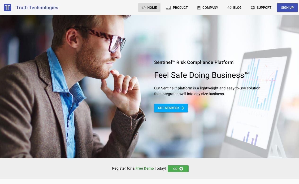
The prior corporate website has seen a little update in 2017, but largely contained the same content as its predecessor. We wanted something simple and one that aligned with our new corporate core values.
The content should also render well on both modern, mobile devices as well older browsers. Our traffic and customer base shows a wide range of visitor types, from very tech-savvy investors to older financial institutions.
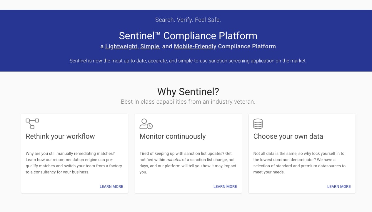
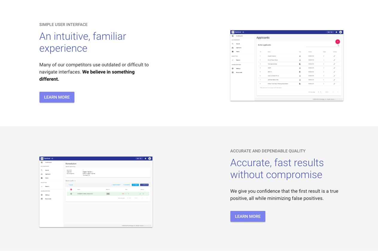
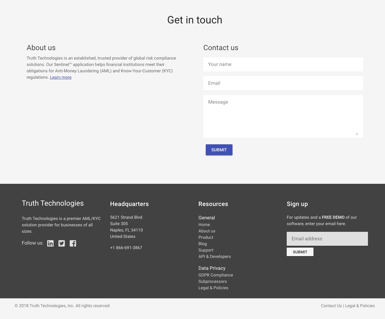
So, I opted for a simple layout, healthy contrast, and responsive design. Colors were selected from the Material Design color palette, those that also matched our new application colors.
Tools & Techniques
Prototyping and graphics were done using Sketch.
Coding was with server-side rendered (SSR) Vue.js and Vuetify, and deployed on Google Cloud Platform (GCP).


