Company Rebranding
Overview
My contribution
Tags
Description
Concept
As part of an overall turnaround strategy, they felt strongly that a new vision was required for the company, its values, and products. Branding was a key element in this vision, one that would reflect a truly fresh start.
From a design perspective, this was liberating, because it meant a nearly blank page. The market would largely be the same, with a new approach and adjustments to messaging and voice.
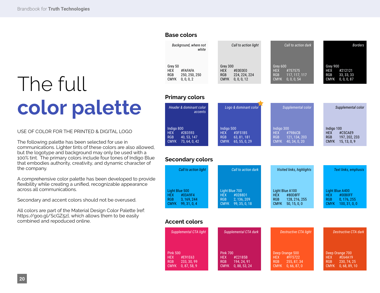
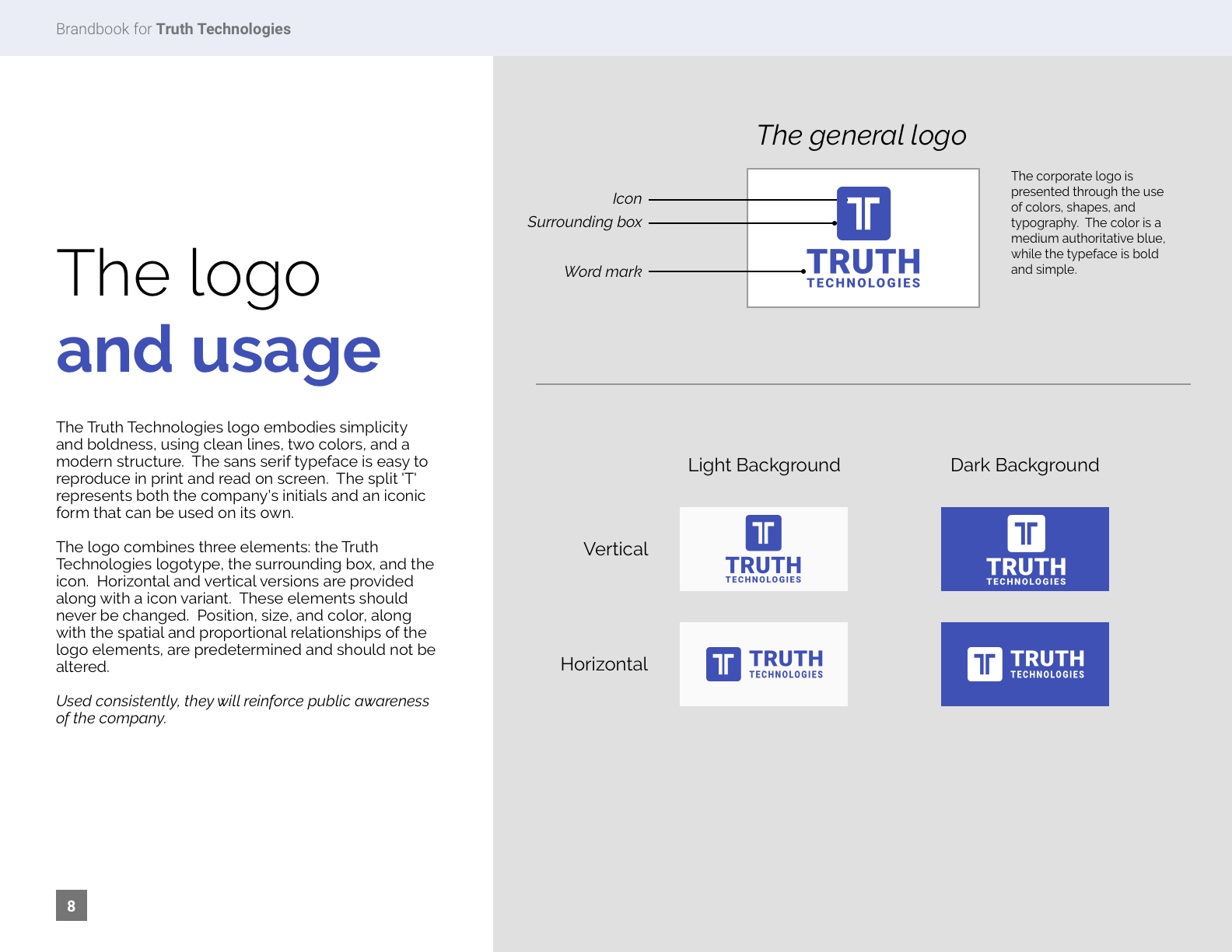
Often, people identify brand with logos, colors, and other visuals. It’s true that these things would change dramatically. However, they did so not as the first step, but rather as a natural outcome of the entire process.
Process
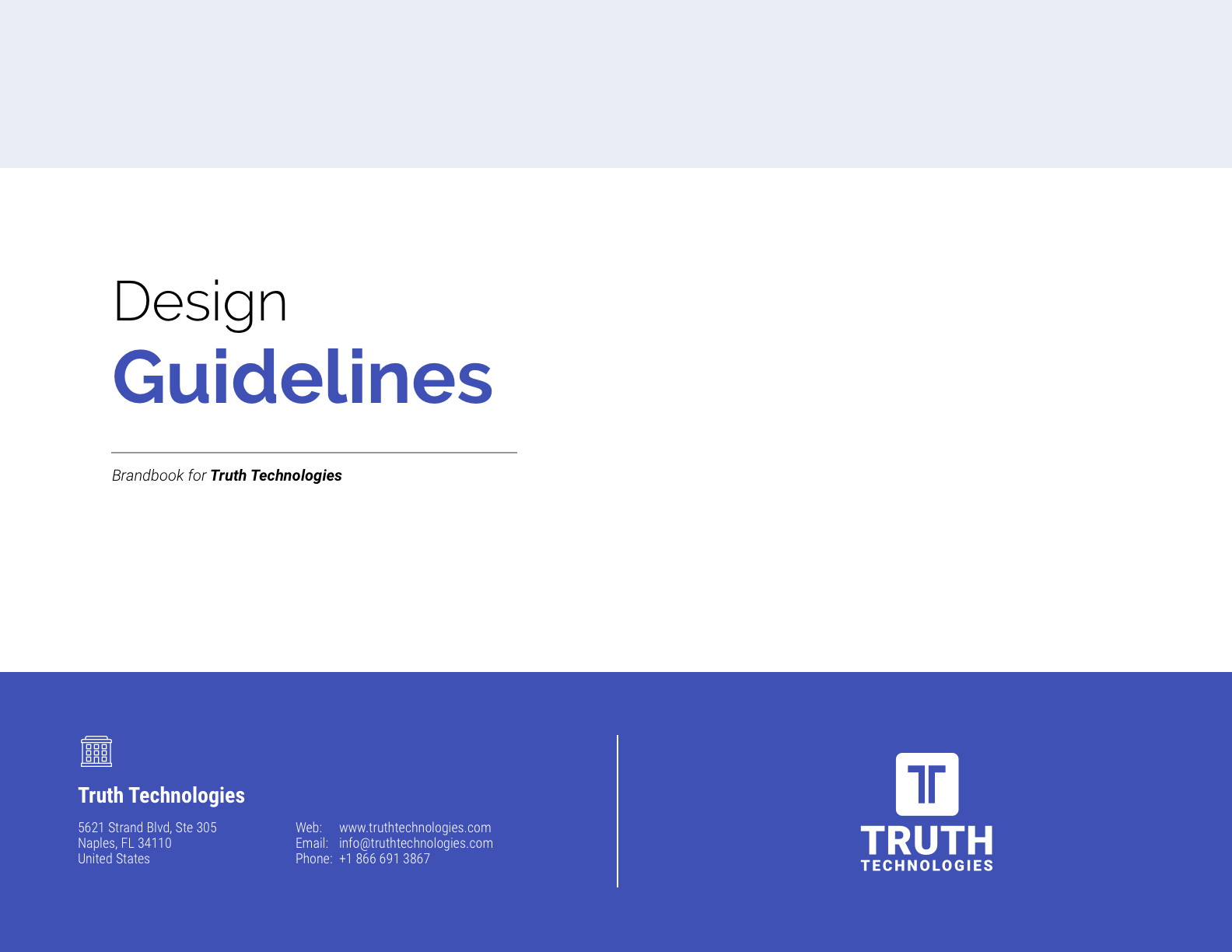
A Branding Guide would become the primary tool to explore and define the new brand. In the end, this would also serve as a reference for other deliverables, like websites and sales presentations. The end result was very much a modernization of the brand and there were many reasons for this.
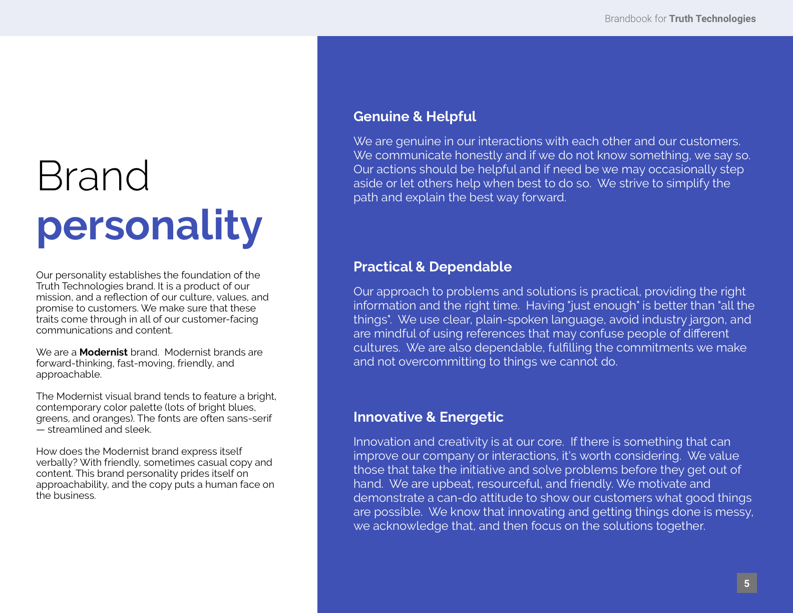
Getting to that modernization involved first defining what the company personality is or would become. Lots went into this, including product and market exploration and reassessment of the company’s organization.
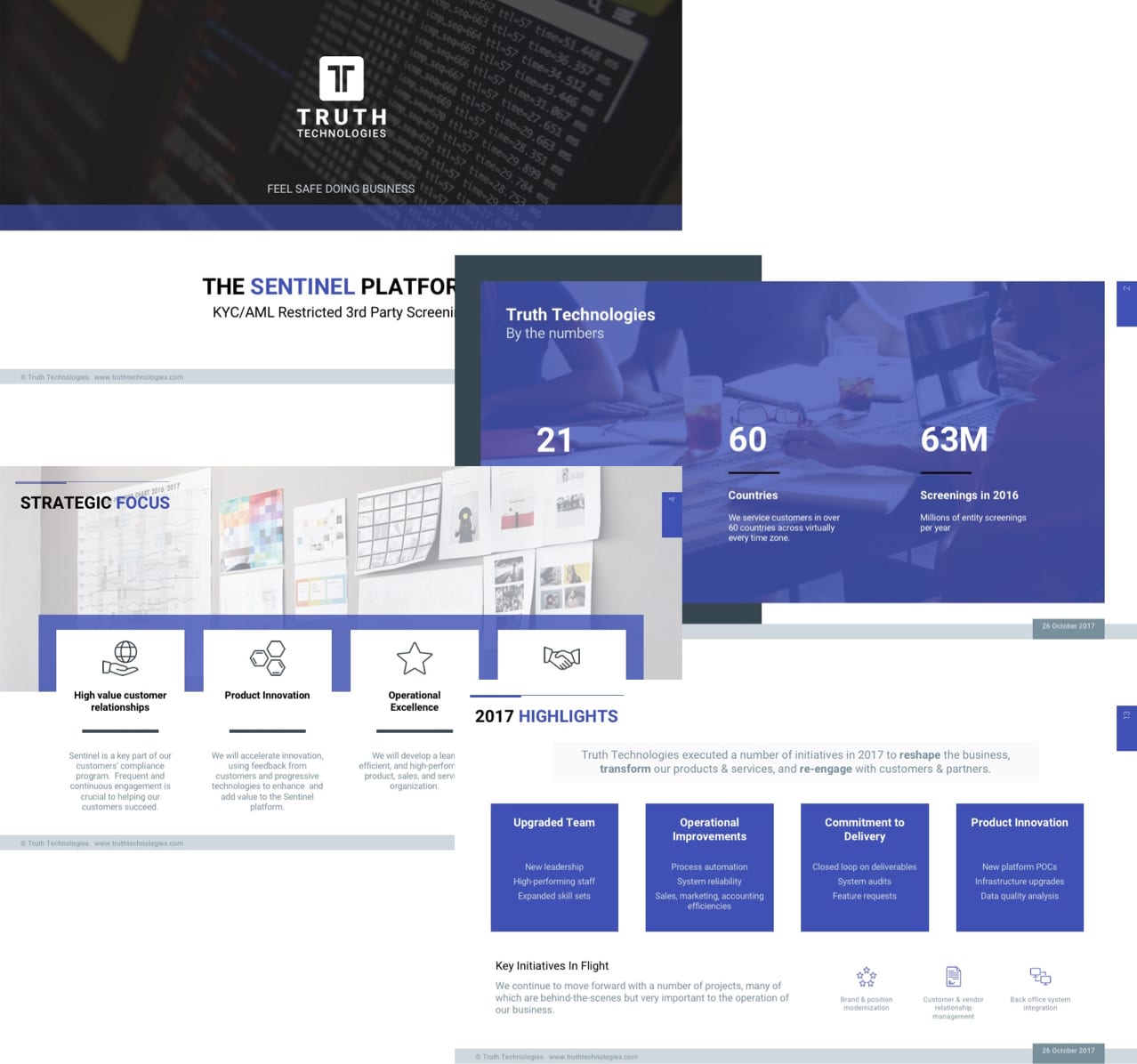
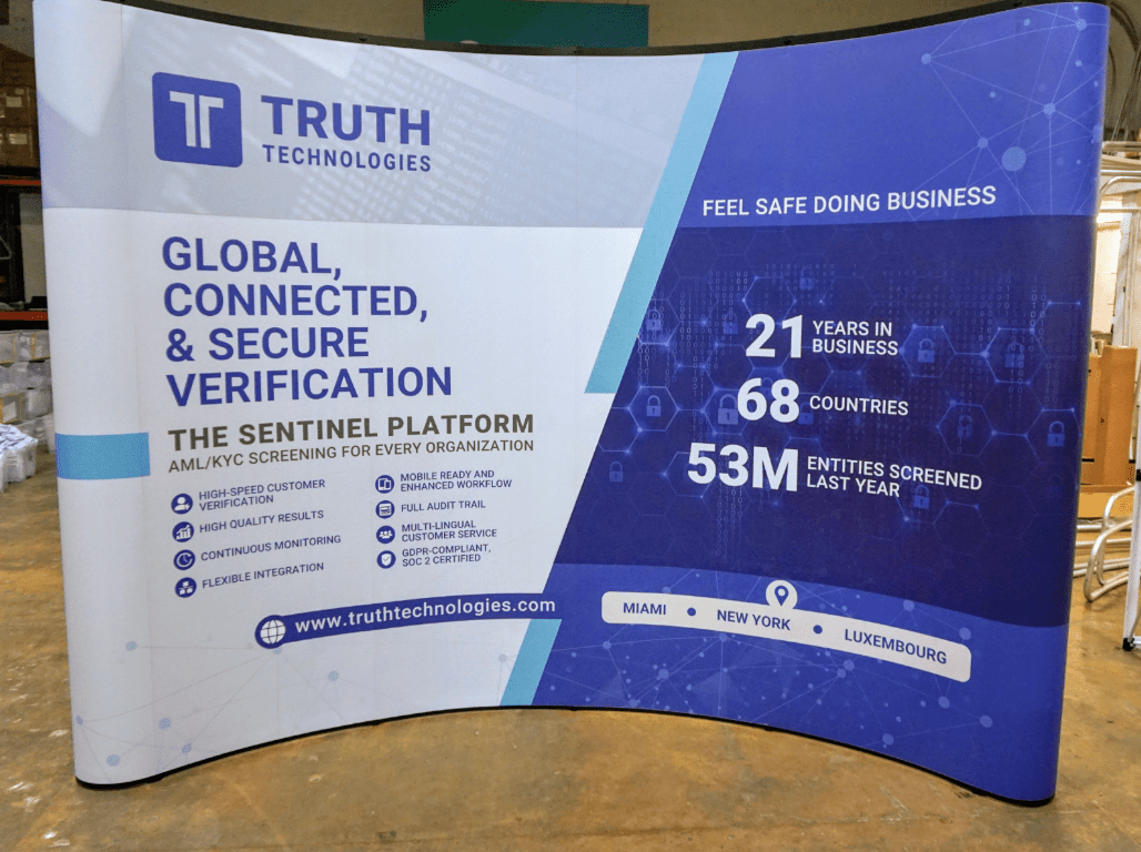
You can see from the project samples shown here that we defined a personality we felt the company should strive for and utimately follow. Colors, logos, and all of the remaining design and visual choices have their start in that personality.
Tools & Techniques
Prototyping and graphics were done using Sketch.
Artifacts
Artifacts produced:
- Logo design
- Branding guide
- Sales presentation
- Trade show booth

